ShopDreamUp AI ArtDreamUp
Deviation Actions


Suggested Deviants


Suggested Collections


You Might Like…


Featured in Groups


Comments6
Join the community to add your comment. Already a deviant? Log In
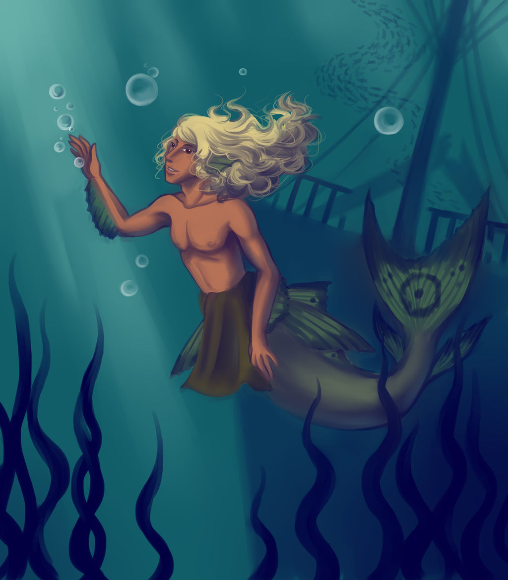
Hello! I'm here from Comment Tag looking for purple. Those shadows and the sea weed have a purplish color to them right? I'm going to pretend they do cause I like this picture and wanted to talk about it.
The colors you used on this are fantastic. All those blue shades in the background really gives this an underwater feel. The way you made them green gives it a real warm feel to it, these aren't frigid lonely depths more a calm tranquil place to dive. The water color and the way the light filters down from above sold me on underwater. The sunken ship and seaweed are great environment details as well.
Sam's colors are great too. The color contrast makes him leap into view, but the colors still match the background enough that he feels like he belongs here. I also love all the little details you added; the fin rays and the circle markings, as well as how his hair is just floating behind him. The bubbles and his hair give some movement to this scene, but his posture and expression are so relaxed as he passes an idle moment.
The ship makes me wonder about where the sea floor is. The dark shadow heading down from his waist feels like the edge of the ship sinking further down. This seems wrong to me, with the railing along the top it seems like we're seeing the middle of the ship. it might be that tall, but the edge probably shouldn't be that straight. I would have thought we'd see an irregular edge where the ship broke, or maybe the bowsprit extending in front of Sam to make that edge be the bottom of the hull.
This is more of a general comment about what I see in your gallery, but might not necessarily be a problem in this piece. Your figures tend to have level shoulders and straight heads. Generally people don't have good posture like that, and in some cases it makes your figures seem a little stiff. Sam isn't reaching very high, but when you reach up with one arm it's shoulder will rise while the other shoulder droops down. People tend to slouch a bit and end up with hip and shoulders that aren't parallel with the floor, I thought this was a pretty good blog post about it.
The same goes for the heads, having a slight turn or lean could add some emotion or characterization. Like with Sam looking up in this you do incorporate this, but I think it might not hurt to exaggerate it a little more.
Excellent work on this one though!
And Tag! You're it... Head over to jeswebbie's gallery and find something with "Kinship".